E-commerce Platform
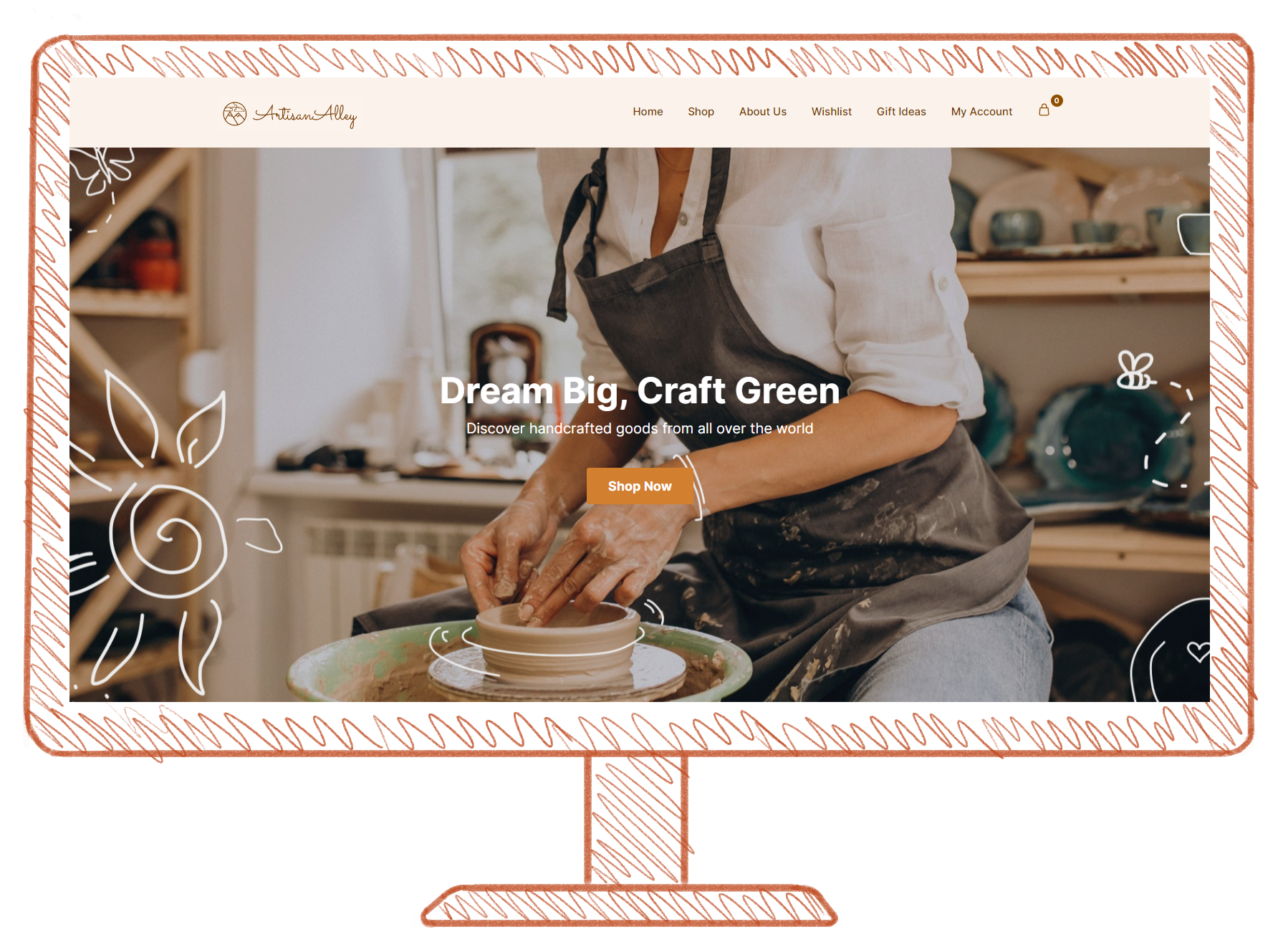
This solution has been built in WordPress and WooCommerce, and it’s based on a fictive company called ArtisanAlley which offers a platform for artisans to share their work all around the world, increasing their sales, and becoming part of a community that appreciates the value of handmade products.
Overview
Focus Area
WordPress (WooCommerce)
Tree Testing
UX Laws
Design Manual
Brand Design
Main Role
Managing WordPress
Graphic Designer
Team
4 people
Client
Fictive
Time
3 weeks
Jump to desired section.
Tree Test
Why?
For our e-commerce project, conducting a tree test was essential to ensure our navigation system is intuitive and easy to understand and use. A tree test allows us to evaluate the effectiveness of our website’s information architecture by presenting users with a hierarchical structure of categories and tasks and asking them to locate specific items or sections.
What did we get out of the test?
By conducting a tree test, we gathered valuable insights into how users interact with our navigation system. We can identify any potential issues or confusion users may encounter when trying to find products or information on our website. This allows us to make informed decisions about the organization and labeling of our navigation menus, ensuring that they align with users’ mental models and expectations.
Ultimately, the goal of the tree test is to optimize the user experience by streamlining navigation and making it more intuitive and user-friendly. By identifying and addressing any usability issues early on, we can enhance the overall usability and effectiveness of our e-commerce website, leading to increased customer satisfaction and improved conversion rates.
UX Laws
Aesthetic Usability emphasizes the importance of visual appeal in user experience design. It suggests that users are more likely to perceive a product as usable if it is aesthetically pleasing. In other words, when a website or app is visually attractive and well-designed, users are more inclined to engage with it positively, leading to higher satisfaction and usability ratings.
To achieve this, we maintained a cohesive color palette that resonates with our brand identity and evokes a sense of warmth and authenticity. Additionally, we carefully selected appealing images, ensuring they not only complement the content but also enhance the overall aesthetic. To further elevate the visual experience, we took the extra step to tailor some of these images, adjusting them to align with a specific aesthetic that reflects our brand’s unique personality.
Aesthetic Usability Law
In implementing Dual Coding principles, we strategically employed a combination of textual content and imagery throughout our website. By doing so, we aimed to enhance user comprehension and retention of information. We catered to different learning styles and maximized the effectiveness of our communication. This approach not only facilitated understanding but also enriched the user experience, making our website more engaging and memorable for visitors.
Dual Coding
By grouping related content and visual elements near each other, we created clear visual cues that guide users’ attention and convey relationships between items. This deliberate arrangement ensures that users can quickly identify and process information, enhancing our interface's overall clarity and coherence. Through thoughtful application of the Law of Proximity, we aimed to streamline the user experience, making it easier for visitors to navigate our website and access the content they need with minimal effort.
Law of Proximity
Tone of Voice
We developed a genuine tone for ArtisanAlley that reflects its focus on craftsmanship and sustainability. It emphasizes creativity with a sense of originality and a subtle touch of personality. The tone is approachable and straightforward, ensuring customers feel supported throughout their experience.
Design Manual
We created a design manual for ArtisanAlley that serves as a comprehensive guide to their corporate visual identity. It details everything from brand colors and typography to the tone of voice for communication. The manual provides clear guidelines for logo usage, including dos and don’ts, to ensure consistency across all platforms. It also includes mockups to show how brand elements appear in different contexts, helping maintain a cohesive and effective brand representation across all channels.


